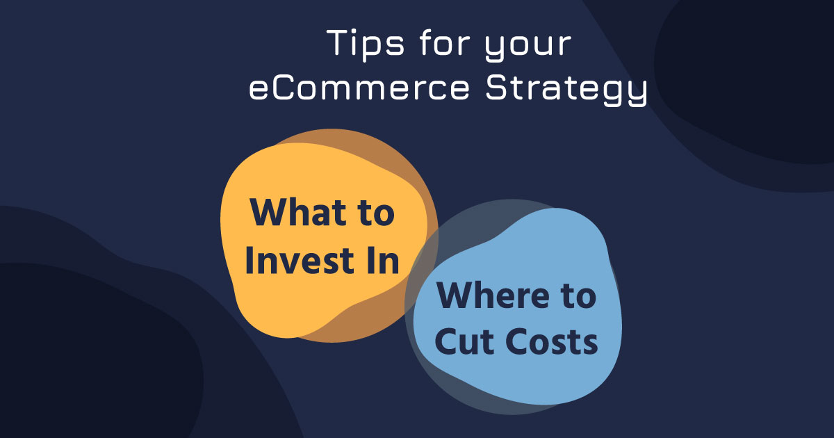
1. KISS
Keep It Simple Stupid, or maybe it is better said Keep It Stupid Simple in this case. When you are designing an eCommerce website, you have to keep the main goal in mind; leading people to the checkout page!
This means you are looking at concise information, not being afraid of a little negative space, and steering clear of using every feature your site may come with. Don’t distract your visitors from finding what they want. Keep your eye on the prize.
If it prevents or distracts from the goal, it is not needed.
2. Your Brand is Key
A brand is much more than a logo. It is your voice, how you are different from your competitors, and most importantly it is what you are all about deep down.
Remember, these are actual people visiting your website and they want to purchase products from an established brand. No one wants to think they finally found what they are looking for only to land on a site that looks like spam. People want to connect with a brand that they can build a connection with.
So, if you really want to drive sales, you’ve got to get your brand at the forefront. If you don’t have one yet, take some time to define your brand. It will pay off in the end.
3. Is It Easy?
Speaking of connecting with your audience – establishing your brand will help you to think like them as well. This is especially important when designing your eCommerce site so you can offer what they want.
You can put yourself in their shoes and create an easy shopping experience for them. By easy we mean; well designed, easy to navigate, and easily understood categories. You want to streamline the path to what they are searching for.
This isn’t a set it and leave it process either. This may always be changing as your brand and your audience evolves. It’s important to always be testing and paying attention.
4. Color is Your Friend
Let’s not be that friend that abuses the relationship, ok?
Just because your favorite color is blue doesn’t mean everything on your site needs to be blue. Take the time to decide what fits your brand. What is appropriate for the emotion you want others to feel upon coming to your site?
Color can make all of the difference, especially when it comes to your website’s Calls To Action (CTA). Colors like green, blue, and orange are always good starting points. New studies are even showing that red can increase conversions at an impressive 34%.
You will also want to consider making your color choices accessible for all viewers. This means keeping in mind contrast ratios for those who may have visual impairments. This is about 7% of the population in the United States. That’s 10.5 million people!
With a resource so powerful at your disposal, make sure to give it the time and research it deserves to make your eCommerce design a converting machine.
5. Good Photography Practice
Would you buy something you’ve never seen? I know I wouldn’t! Well, without high-quality images on your website, that is what you are asking your visitors to do.
You want to continue to build trust and confidence in your visitors for your products with your photography. So, take a few steps to make this happen. Have your products on a good clean background. Don’t add in any extras, both digital and physical. Let the product be easy to distinguish. Finally, make sure to offer a look at your product from multiple angles.
Don’t let your visitor feeling unfamiliar with the product be a reason for them to not buy your product. Use good photography!
6. Break It Up
Don’t waste any more time on these overly informative pieces of content on your eCommerce page. It’s like the big steak at a restaurant where you get your picture on display if you can eat it in entirety. Sure you could probably do it, but it won’t be enjoyable getting through it. So, you opt to order the more enjoyable fillet.
When it comes to content it’s the same way. Your content needs to be easy to scan and understand. So, break it up. You can do this across pages, in blogs, through video, and by creating more digestible paragraphs of info all throughout your site.
Your type hierarchy is also a very important part of making your site scannable. Does the size of your headers and paragraph text make sense? Can you distinguish between them?
The easier it is to take in your content the quicker it is for your visitor to make purchasing decisions that lead to a sale.
7. Compatibility & Consistency
Let’s touch a little more on the idea of not looking like spam. You’ve defined your brand and now you’re building your new site. Your new website should be built with the purpose of building trust with your visitors.
This means your elements like color palette, navigation, and footer are consistent throughout your website. A good place to start is by taking care of the obvious details such as typos, functioning links, and buttons that direct you to the correct place. Some sites offer email marketing. If you are going to be using those features, how do those emails look? Implement your brand features like colors and fonts into those as well.
You also want to consider some other elements. Make sure your site is responsive. Over 70% of traffic is more than likely coming from a mobile device. Do you know how your site looks on that screen? What about a tablet? You want to give the impression that you are consistently meeting your customers wherever they are with the brand they know and trust.
All of these elements must be considered. Staying on brand creates a uniformed look which leads to a user’s trust in your company. Remember, you are asking people to hand over some pretty sensitive information on your website in order to make a sale. If you don’t take yourself seriously, how can a potential customer?
8. Recognizable Elements
There is some comfort in things that seem familiar. In the same way a real estate agent trying to sell a house might bake cookies before the prospective buyers walk-in, you want to create that same feeling when people come to your site. They might not know what it is, but they know where things are.
You need to have a few familiar features. Have your logo in a familiar spot, off to the left, or on top and centered. Make sure you have an add to cart button included with your products. Is your mobile menu icon something recognizable like the hamburger (yes, that is what it is called)?
The two most important elements to have are a shopping cart icon and a search field to enter into. The shopping cart allows users to see what they have added to their cart as well as know where to go when they are ready to make their purchase. The search field allows users to quickly and effectively find exactly what they are looking for.
9. Honesty is Always the Best Policy
How can you be honest on a website? Well, it comes in many shapes and forms.
We have already covered good photography. Making sure those photos always accurately reflect the product is a great way of being honest with your customers. You also want to make sure your descriptions and copy on your site is being truthful as well. A common mistake people make is burying pricing information. Make it easy for people to find and understand, especially shipping costs.
Another way to remain honest and improve your site’s Search Engine Optimization is to allow users to review your products. 61% of online shoppers say they read the reviews before making their decision to purchase.
10. Keep on getting Better
You may be tempted to make this into a checklist and think, “If I do all of these things my website will be awesome, my conversions will skyrocket, and I can sit back and crack open a cold one.” Well, you may get to do that for a little while, but an eCommerce site is never truly done.
All of these steps can, and should constantly be revisited to ensure your brand and site are evolving in meaningful ways that both connect with your audience and make their lives easier. Don’t be afraid to ask for help if you need it.
Happy online shopping!
Need help optimizing your eCommerce? Contact us here at Ballistic Agency.